
Introduction
During our work as frontend developers we often have to retrieve data from the backend. In the meantime we usually want to show a loading state to the user to indicate that something is going on.
Making those loading states look appealing, however, might be tricky. In this article, we'll be making the loading state of a simple team member list page.
Let's get started
We will start off with a blank React project. For our styles we'll be using styled-components. We will also add lodash to make our lives easier.
This is our initial code.
import _ from "lodash";
import { useEffect, useState } from "react";

import fetchMembers from "data-fetching"

export default function App() {
  const [teamMembers, setTeamMembers] = useState([]);
  const [isLoading, setIsLoading] = useState(false);

  useEffect(() => {
    setIsLoading(true);

    fetchMembers().then(data => {
      setTeamMembers(data)
      setIsLoading(false)
    })
  }, []);

  return (
    <div>
      <h3>This is our team:</h3>
      {isLoading ? (
        "Loading..."
      ) : (
        "Not loading"
      )}
    </div>
  );
}
We have a useEffect in which we fetch our data from the backend. We use the isLoading boolean state variable to indicate whether our app is fetching or not and teamMembers to store our data.
In case you are using something else for data fetching, most probably, there's a way to get a value for isLoading.
We will add the TeamMemberBox component, which we will use to visualize the team members.
The component itself is pretty straightforward.
import * as S from "./styles";

const TeamMemberBox = ({ teamMember }) => (
  <S.Container>
    <S.Avatar src={teamMember.avatar} />
    <S.Name>{teamMember.name}</S.Name>
  </S.Container>
);

export default TeamMemberBox;
import styled from "styled-components";

export const Container = styled.div`
  width: 300px;
  padding: 5px;
  margin-bottom: 5px;
  box-sizing: border-box;

  border-radius: 3px;
  border: 1px solid #cccccc;

  gap: 10px;
  display: flex;
  align-items: center;
`;

export const Avatar = styled.img`
  border-radius: 50%;
`;

export const Name = styled.div`
  font-size: 1rem;
  font-weight: bold;
`;
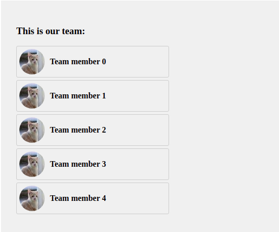
We will also update our page so that instead of displaying the Not loading text we will visualize the data we have fetched.
...
      {isLoading ? (
        "Loading..."
      ) : (
        teamMembers.map((member) => (
          <TeamMemberBox key={member.id} teamMember={member} />
        ))
      )}
...
So far, our team member list page looks like this.
You might feel like this doesn't look very good while loading.
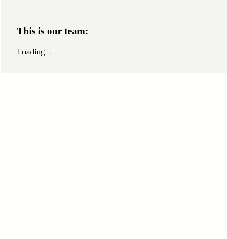
How can we make it better?
It is time we add the last piece of the puzzle - React Loading Skeleton. We will be using it to make our placeholder which we will show while the data is being fetched.
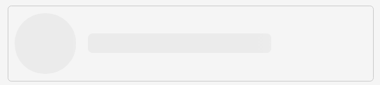
We will introduce the TeamMemberBoxPlaceholder component which is a copy of the TeamMemberBox component we already have but with Skeleton instead of data.
The only argument which we will be adding to the component props is count, which is an optional number. We will use it when we want to render more than a single placeholder component.
import _ from 'lodash';

import * as S from "./styles";

const TeamMemberBoxPlaceholder = ({
  count = 1
}) =>
  _.range(count).map((index) => (
    <S.Container key={index}>
      <Skeleton circle width={50} height={50} />
      <S.Name>
        <Skeleton width={150} />
      </S.Name>
    </S.Container>
  ));
The resulting component looks like this.
We will attach the TeamMemberBoxPlaceholder component to the original TeamMemberBox component. This is the final code for TeamMemberBox(the styles remain unchanged).
import _ from "lodash";
import Skeleton from "react-loading-skeleton";

import * as S from "./styles";

const TeamMemberBox = ({ teamMember }) => (
  <S.Container>
    <S.Avatar src={teamMember.avatar} />
    <S.Name>{teamMember.name}</S.Name>
  </S.Container>
);

const TeamMemberBoxPlaceholder = ({
  count = 1
}) =>
  _.range(count).map((index) => (
    <S.Container key={index}>
      <Skeleton circle width={50} height={50} />
      <S.Name>
        <Skeleton width={150} />
      </S.Name>
    </S.Container>
  ));

TeamMemberBox.Placeholder = TeamMemberBoxPlaceholder;

export default TeamMemberBox;
The only thing that is left to do is to replace the Loading... text in our page with the placeholder component.
...
  return (
    <div>
      <h3>This is our team:</h3>
      {isLoading ? (
        <TeamMemberBox.Placeholder count={5} />
      ) : (
        teamMembers.map((member) => (
          <TeamMemberBox key={member.id} teamMember={member} />
        ))
      )}
    </div>
  );
...
As a result of our changes, the final team members list page looks like this.

Conclusion
The Skeleton screens look nice and make your users feel like the app is loading faster. However, presenting them blank screens and old-fashioned spinners harm the overall UX of your application.
The code from this example can be found here.
Check our blog for more useful articles 🤠.